Case study · Consumer health AI
Control Health
Control Health is a consumer AI health app: a person's records, labs, and wearables, turned into plain-language answers and a lab plan built for them. It began as a loose PRD with no name, no brand, and no working AI. Our team of three shaped it into a closed beta with real users, in 12 weeks.
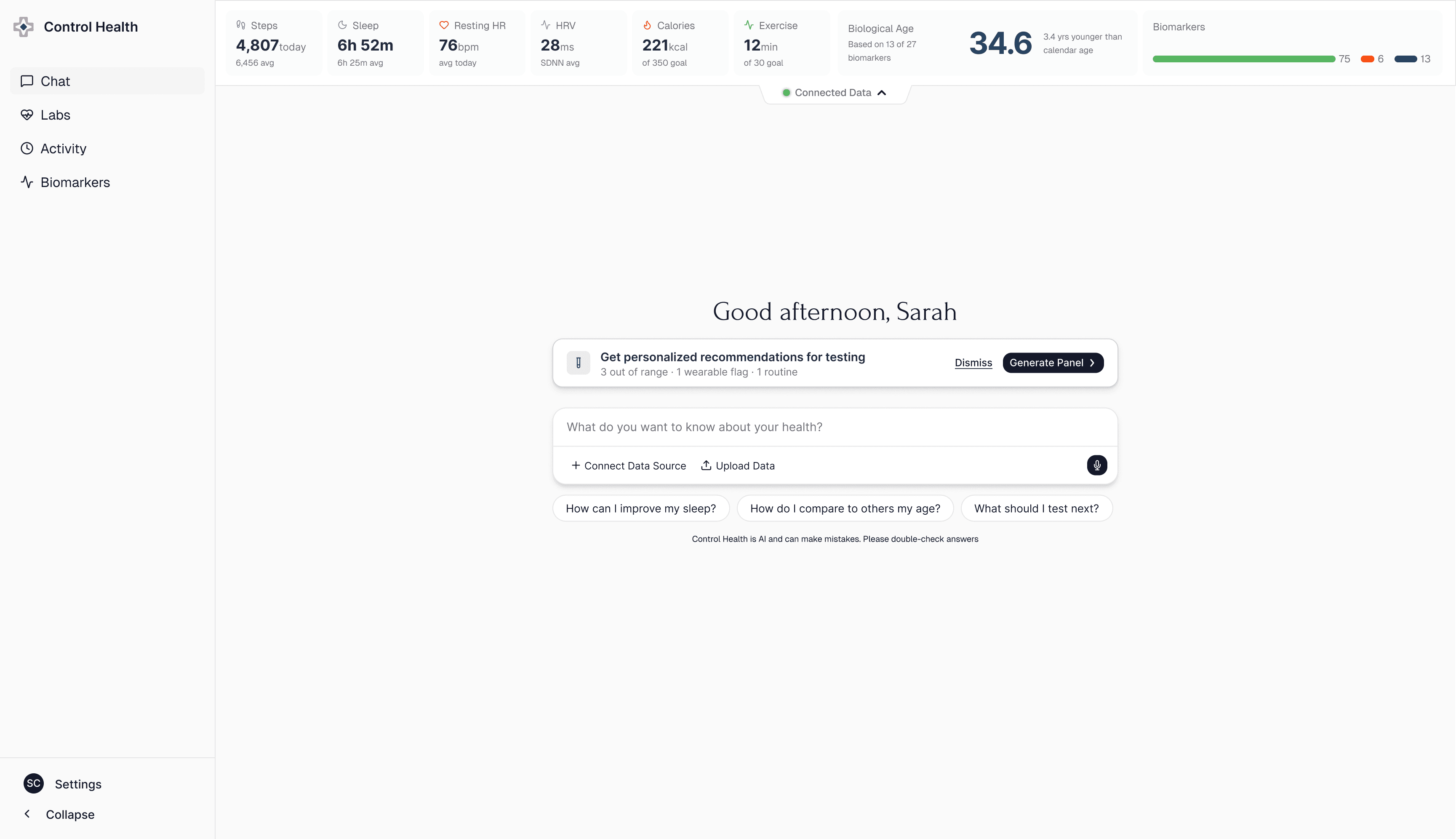
Onboarding
Showing the payoff before asking for a single connection.
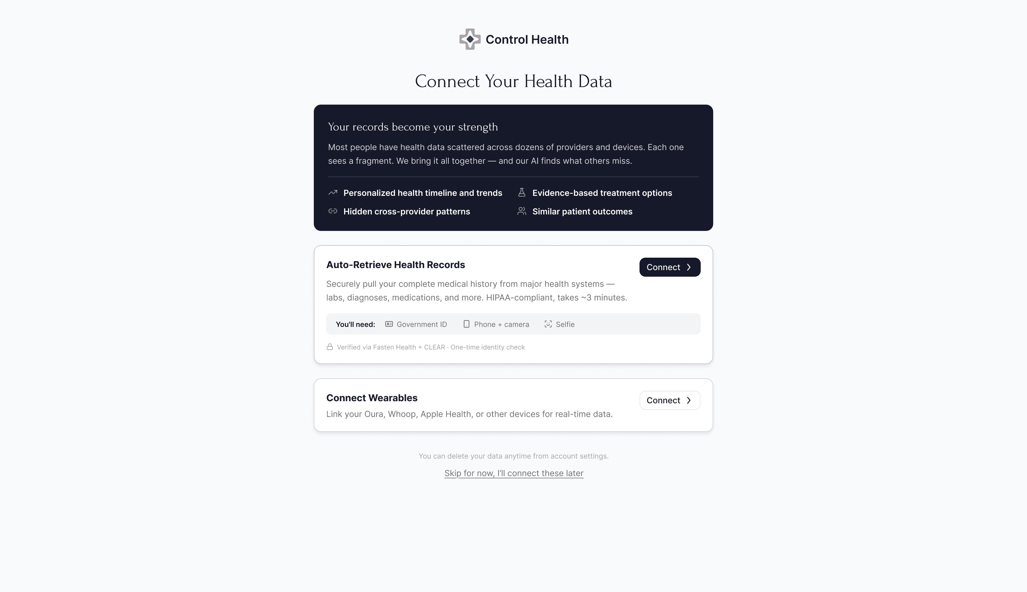
Handing over a full medical history is the biggest ask, so onboarding shows the payoff before asking for a single connection. Records come first, since they're what make the answers about you, not the population.
Cold start
An empty state that still gives you something to do.
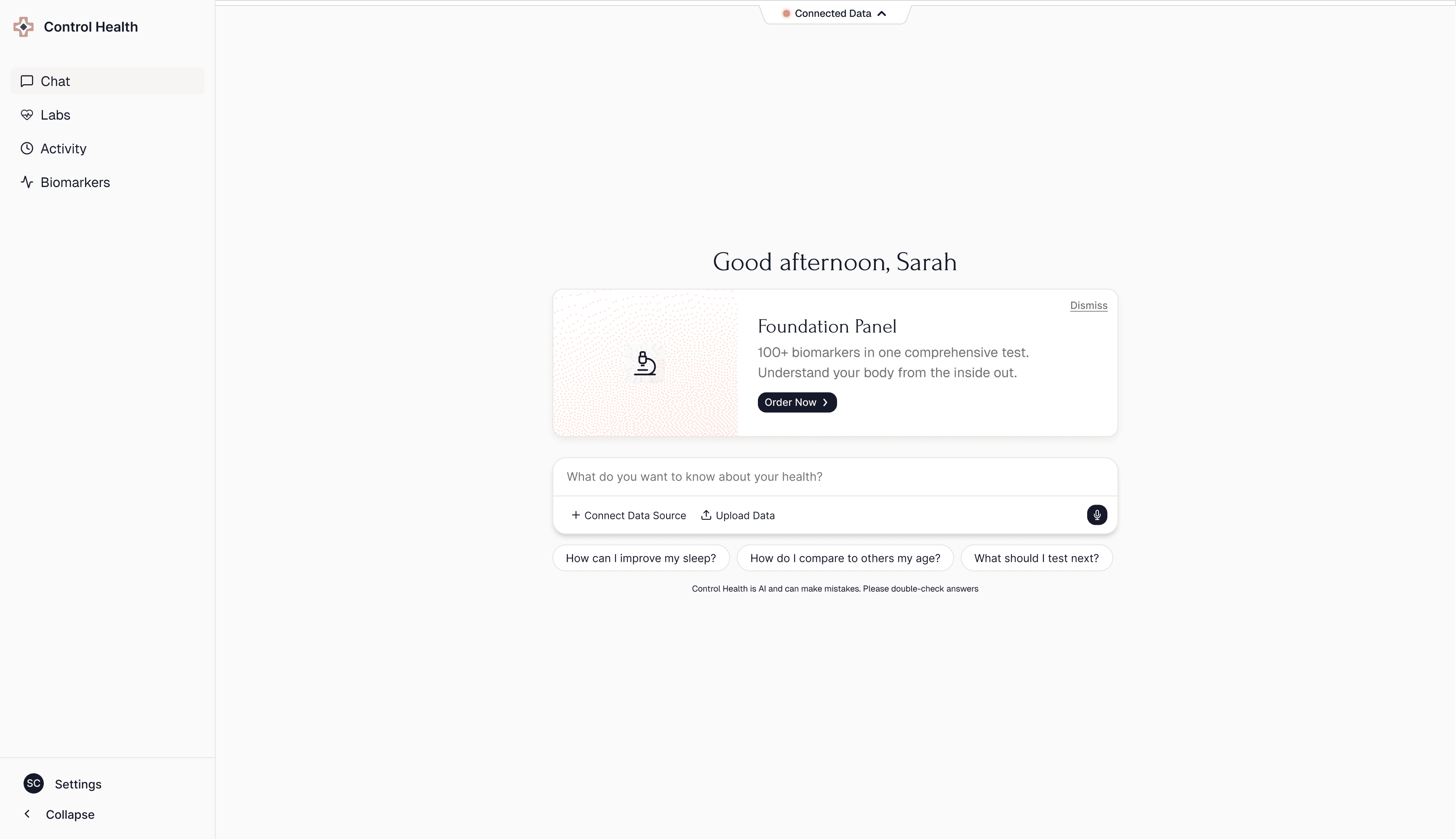
Trust is hard to earn in a health app, and most people arrive before any records have synced. So I designed the empty state first, and designed it to still feel actionable rather than empty: a baseline panel gives someone a real place to start and keeps proving the product is worth trusting, even before they've handed over a thing.
Dashboard & chat
Ask your own records a question, in plain language.
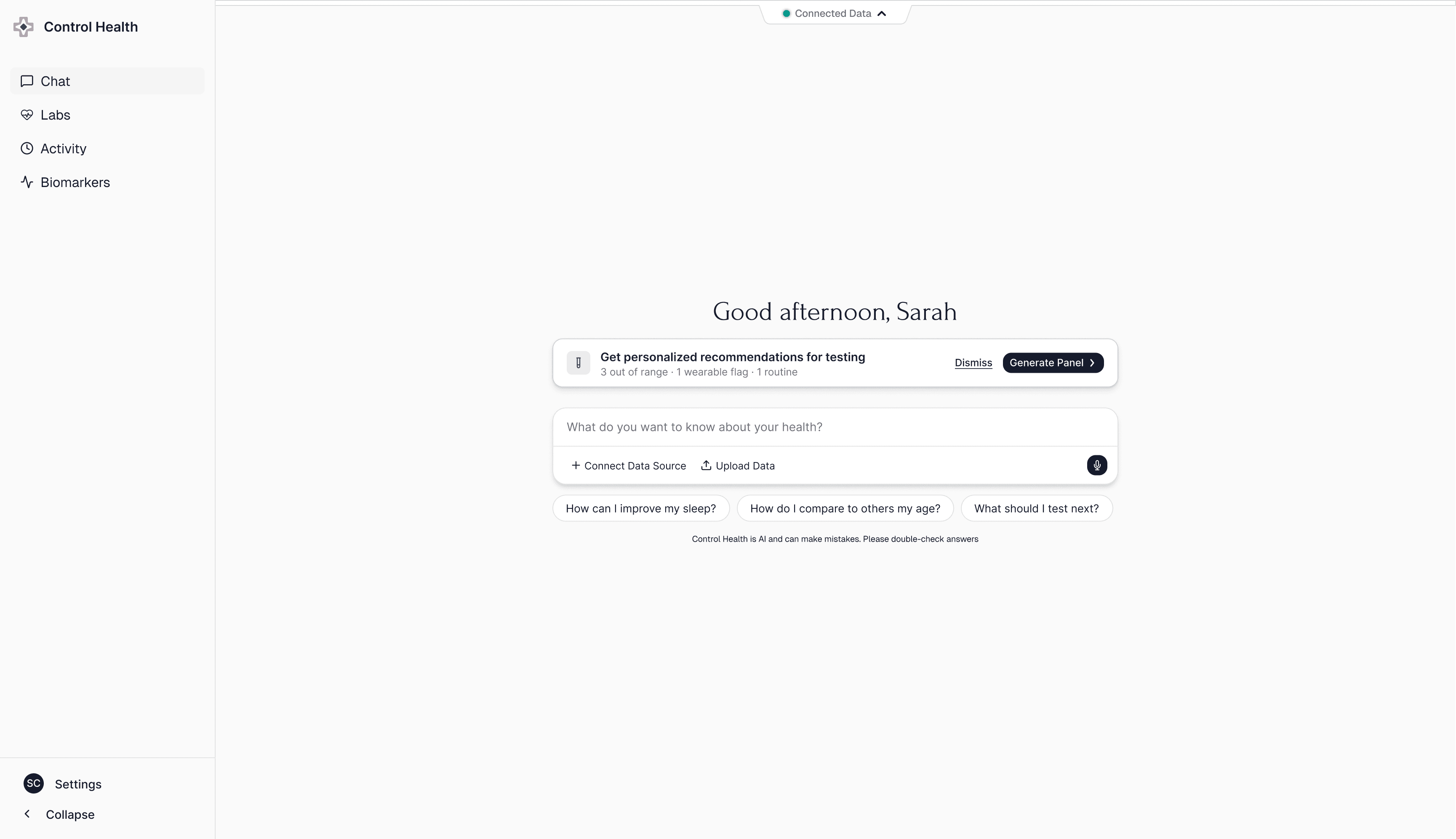
The assistant already holds your labs, records, and wearables, so the home screen opens with a plain question box. Informational, not diagnostic, with most of the care spent on what it won't answer.
Personalized panels
Every recommendation shows its reason.
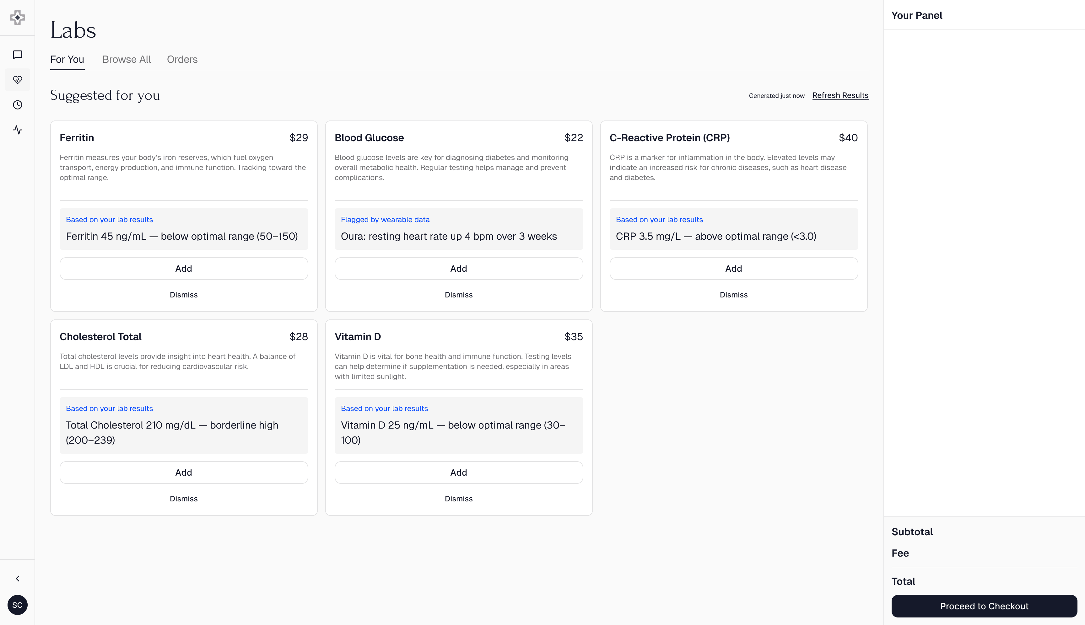
Each suggested biomarker shows why it's there, pulled from your own data, so it reads as care, not an upsell. Rules, not a model, keep it reproducible and auditable.
Control
Add or remove anything, and the price updates live.
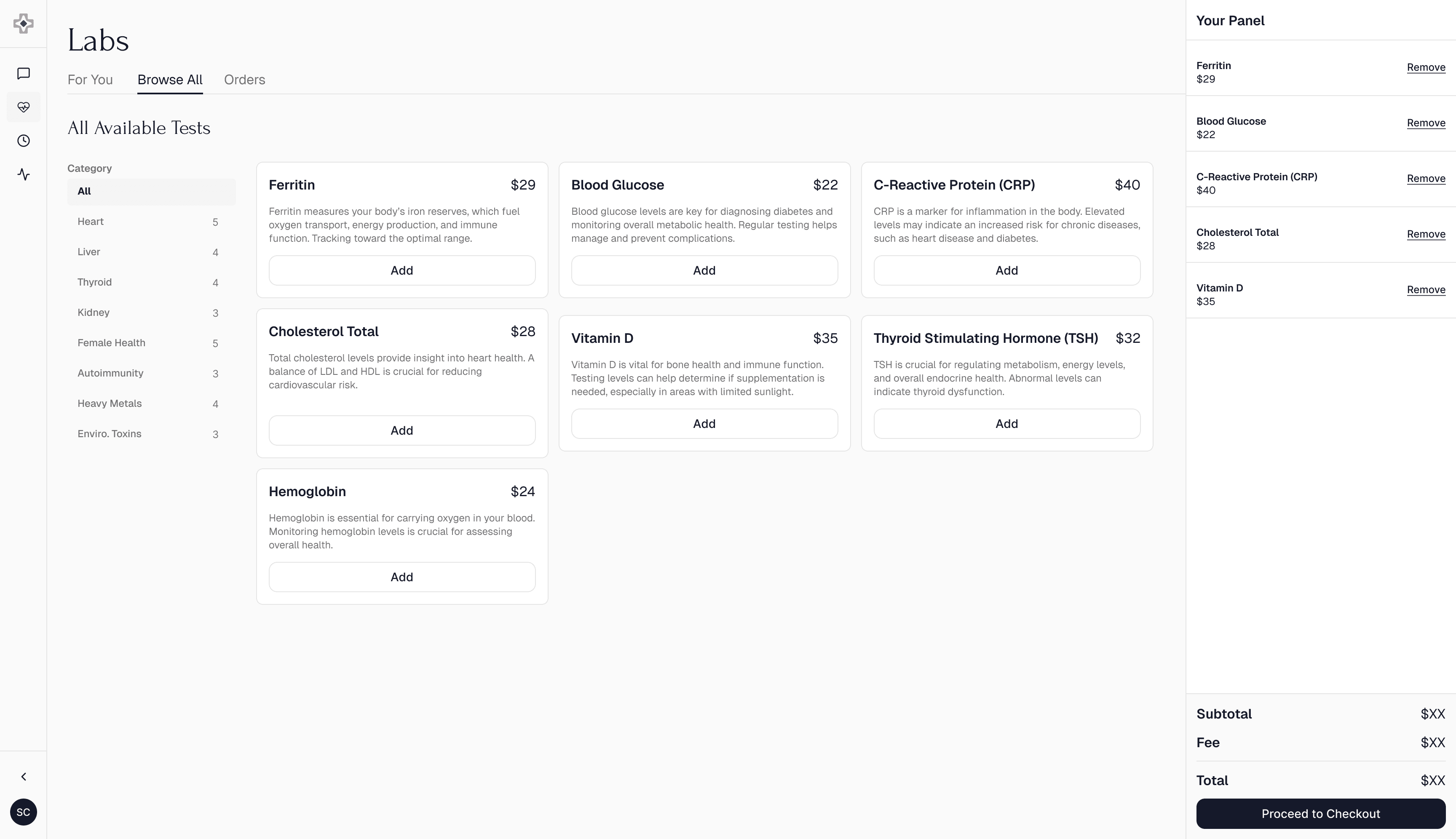
The full catalog is one tab away, everything is removable, and the total updates as you go. That control is what makes people comfortable keeping the markers that cost the most.
Closing the loop
From recommendation to booked draw, in one flow.
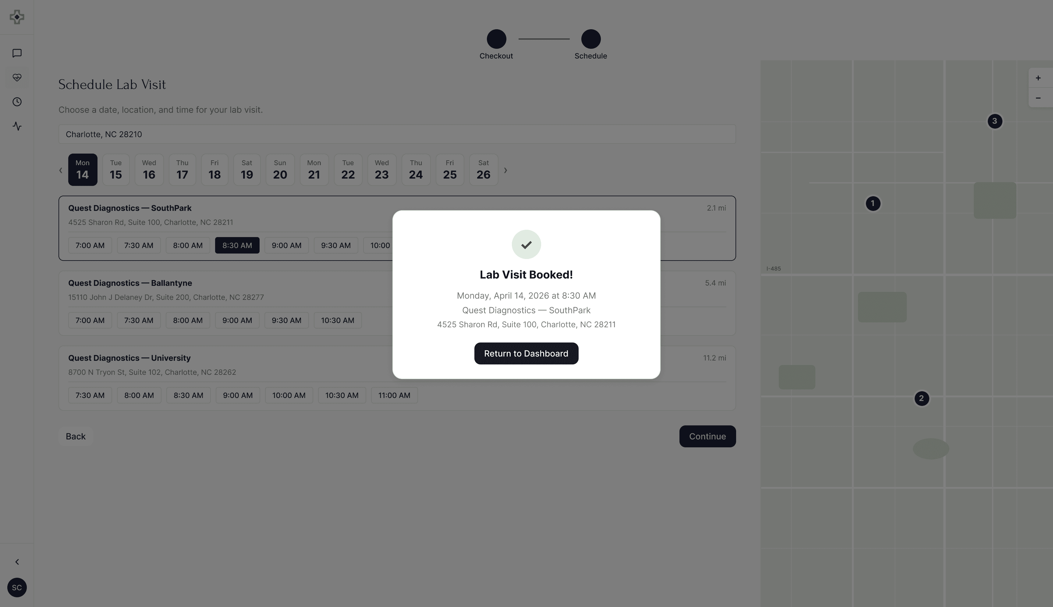
Checkout flows straight into scheduling, with nearby labs and real appointment times, so the loop closes inside the product instead of a handoff to a phone number.
Prep guide
Guiding people all the way through the journey.
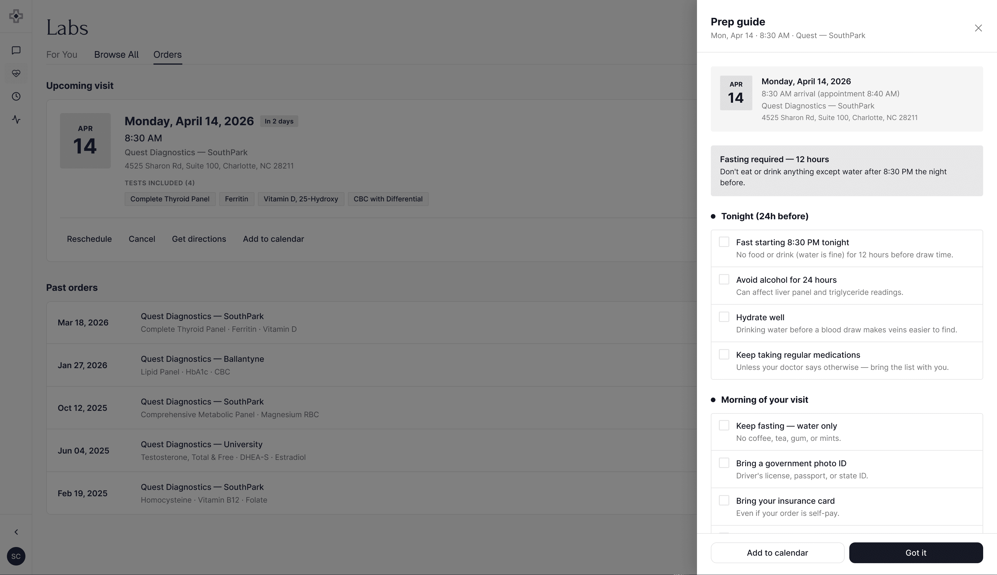
Preparation ran through the whole journey, not just the lab: what to upload, how to read a chat answer, why a panel was suggested, and how to show up for the draw. Each step tells you what is happening and what comes next, tuned to you. The prep guide is the last of these, walking you through the night before and morning of so nothing has to be redrawn.
Outcome
A working consumer-health product, live at controlhealth.ai, built to hold real clinical complexity and stay readable to someone with no medical training.
For a pre-launch product, the honest measure is what the design made possible: medical data a person can reason about, and a recommendation surface people trust because every line explains itself. The patterns underneath, for empty states, messy records, and traceable sources, will hold up as more data arrives.